Decor trends renew themselves every season, but not all are equal when it comes to transforming an interior sustainably. Between color palettes, preferred materials, and regulatory constraints that weigh on certain choices, comparing approaches helps distinguish what is merely a fad from what truly alters a space.
This article analyzes the most structuring axes of interior decoration, relying on concrete criteria: air quality, traceability of materials, and stylistic coherence.
Decor materials and indoor air quality: a comparison often overlooked
In France, paints, varnishes, adhesives, and floor coverings carry a emission label ranging from A+ to C. This classification allows for measuring the volatile organic compounds released into the space.
On the other hand, some furniture, textiles, and foams do not always have an equivalent display. Therefore, the choice of a decorative product cannot rely solely on its aesthetics or a vague mention related to ecology.
| Product Type | Mandatory Emission Labeling | Point of Caution |
|---|---|---|
| Paints and varnishes | Yes (A+ to C) | Prefer A+ for closed rooms |
| Floor coverings | Yes (A+ to C) | Check the label even on wood imitations |
| Furniture (wood, panels) | Not systematic | Request the technical sheet from the manufacturer |
| Textiles and foams | Not systematic | Ventilate the rooms after installation |
This table highlights a transparency gap depending on the categories. For a decoration project that affects several rooms, cross-referencing available labels with unlabeled materials helps limit the accumulation of pollutants in the same space.
Decor enthusiasts looking to explore varied inspirations can discover the site tendances-deco.fr to fuel their thoughts on material and style associations.
Second-hand furniture and new furniture: traceability and style
Second-hand furniture is no longer confined to informal flea markets. Professional refurbishment channels are being structured: recycling centers, specialized platforms, and control circuits offer restored pieces with quality tracking. This evolution changes the game for those seeking characterful furniture without resorting to new items.
In contrast, new furniture offers a manufacturer’s warranty and calibrated finishes, but its environmental cost remains higher. The PEMD diagnosis, which applies before certain demolitions or significant rehabilitations, now favors detachable elements with mechanical fasteners rather than glued assemblies. This regulatory framework pushes manufacturers to design furniture that is easier to repair and reuse.
Selection criteria between second-hand and new
- Traceability: a refurbished piece by a professional channel often has a solidity and cleanliness check, bringing it closer to new standards
- Style: vintage or second-hand pieces offer a uniqueness that is hard to replicate with mass-produced furniture, especially for old woods or natural patinas
- Durability: a piece with mechanical fasteners (screws, dowels) can be disassembled and repaired, while a glued assembly becomes waste at the end of its life
For a coherent interior, mixing second-hand furniture with a few well-chosen new pieces allows for a personalized decor without artificial uniformity.
Trendy colors and coherence of spaces: beyond palettes
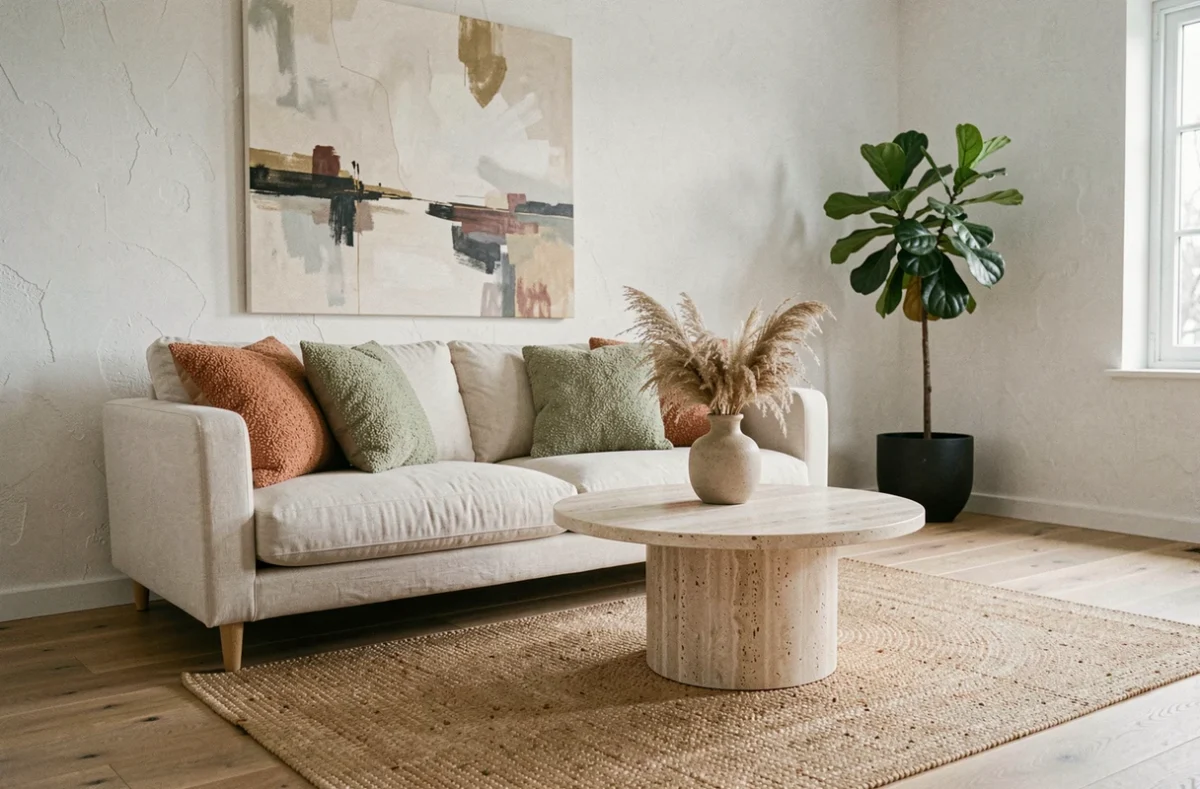
Earthy palettes (clays, sands, terracottas) dominate current decor proposals. These warm shades warm up a space, but their accumulation in all rooms produces a monotonous effect. The question to ask is not “what is the color of the year” but how to articulate colors between rooms.
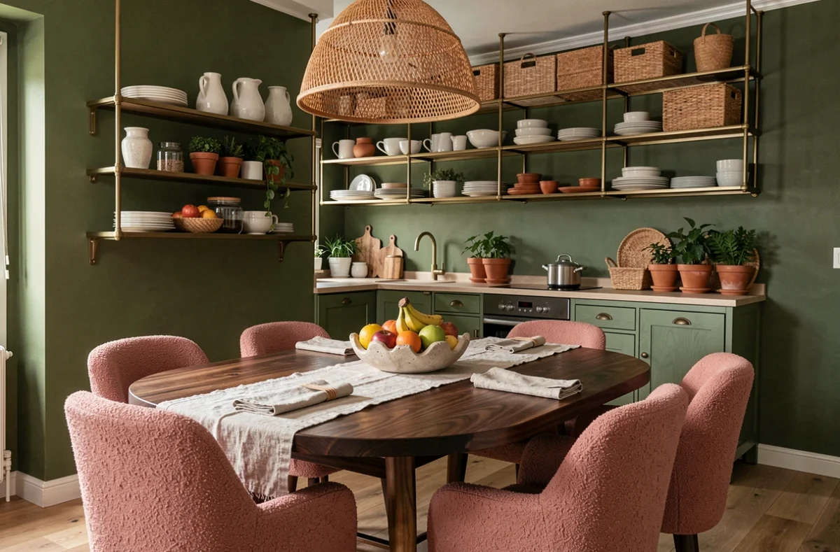
A warm-toned living room gains depth if the adjacent kitchen adopts a cooler or neutral shade. This alternation creates a visual rhythm in the home and avoids the impression of a frozen decor. Materials also play a role: a clay-colored wall paired with a light wood floor does not yield the same result as with dark tiling.
Associations to test according to the room
- Living room: earthy shades on the walls, natural or refurbished wood furniture, textiles in complementary tones (deep blue, olive green)
- Kitchen: neutral or slightly cool colors to contrast with a warm living space, moisture-resistant materials with A+ labeling
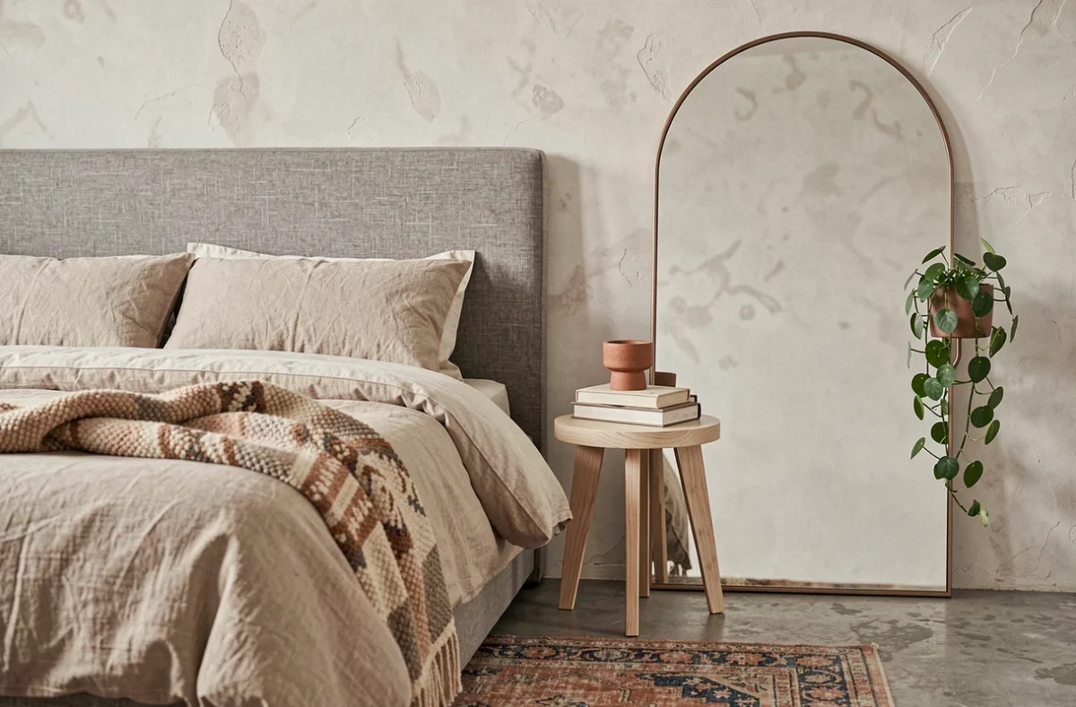
- Bedroom: soft and low-saturated tones, A+ paint mandatory in a closed space where one spends several hours per night
- Entry or hallway: a more pronounced shade or textured wallpaper to mark the transition between outside and inside
The idea is not to follow a single palette but to build a chromatic journey from one room to another.
Decoration after energy renovation: an order that changes everything
Decoration increasingly comes into play after energy performance work. Households that first insulate their walls, attics, or windows modify the visual proportions of their rooms: interior cladding reduces floor space, triple glazing alters natural brightness.
Choosing colors and furniture before finishing insulation is like decorating a space that does not yet exist. A shade chosen to compensate for a lack of light may become too dark once the new windows are installed. A piece sized for an existing wall may no longer fit after adding insulating cladding.
Waiting until the structural work is finished to make decorative decisions avoids costly adjustments. This sequence (performance first, aesthetics later) produces interiors where every decor choice responds to the actual conditions of the room: light, volumes, acoustics.
The most sustainable decor trends are not those that offer the most appealing palette. They are those that integrate air quality, furniture traceability, and the logical sequence of work into the overall reflection. A well-thought-out interior begins with these technical trade-offs, and aesthetic choices adjust to them with greater precision.