
When trying to determine if a specific address is located in a priority neighborhood, the first challenge is not finding a map, but understanding what it really measures. Official mapping tools in France delineate areas related to urban policy, constructed based on the income level of residents.
These are not crime maps or danger rankings. This distinction radically changes how they can be used, whether for a real estate project, a housing search, or a territorial diagnosis.
Priority neighborhoods and tension zones: two realities that the map does not overlap
A designated priority neighborhood (QPV) is classified as such because its residents have significantly lower incomes than those in the rest of the agglomeration. This zoning serves to direct public funding, social support programs, and tax exemptions for businesses that set up there.
This geography is often confused with that of insecurity. An area can concentrate sporadic tensions without being classified as a QPV. Conversely, a priority neighborhood is not automatically a dangerous area. Economic fragility and criminal activity do not always overlap.
To follow the news of hot neighborhoods on Essentium, we have additional insights beyond institutional data, focusing more on recent events and concrete situations on the ground.
Public safety data, on the other hand, comes through other channels: the platform masecurite.interieur.gouv.fr lists police stations and posts, but does not publish a heat map of offenses by neighborhood. Therefore, it is necessary to cross-reference multiple sources to get a realistic idea of an area.

GIS City platform and address verification in QPV
The reference tool for mapping priority neighborhoods is the GIS City platform, operated by the ANCT. It offers two concrete functionalities that other tools do not provide as directly.
- Check if a specific address is located in a QPV by simply entering the postal address. Useful before a real estate purchase or for a grant application.
- Consult the territorial profiles of each neighborhood, with socio-economic indicators (income, employment, demographics) by municipality and department.
- Visualize the former zoning (ZUS, ZRU) defined by the decrees of 1996, to compare the evolution of the boundaries over thirty years.
The priority geography was updated on January 1, 2024. This work was carried out by the ANCT and departmental prefectures based on data from INSEE. The boundaries have changed in several agglomerations, notably in Île-de-France and in major cities like Marseille.
The gap between boundaries and indicators
One point confirmed by field feedback: the indicators associated with the new boundaries are sometimes incomplete. The ANCT has updated the boundaries, but some socio-economic data are still being published. When consulting a territorial profile, it is essential to check the update date of each indicator.
This gap is not trivial. If one relies on the map to compile a file (social housing application, business establishment, territorial diagnosis for a community), outdated data can skew the analysis.
Interactive map of municipalities and zoning: beyond sensitive neighborhoods
The interactive mapping is not limited to QPVs. The Territorial Observatory, also managed by the ANCT, offers a broader tool with several hundred indicators. One can build a personalized diagnosis by overlaying layers: income, housing, service availability, demographics.
For issues related to housing and rents, the A, A bis, B1, B2, and C zoning determine rent ceilings and access conditions to certain tax incentives. These zones cover the entire territory, not just the municipalities under tension. Paris and its inner suburbs (Seine-Saint-Denis, Hauts-de-Seine, Val-de-Marne) are classified in zone A bis, which directly affects the amount of regulated rents.
Do not confuse housing zoning and urban policy zoning: the former targets the regulation of the real estate market, while the latter focuses on social action. A municipality classified in zone A bis may have no QPV, and vice versa.
What the Géo-IDE map adds as a complement
The Ministry of Ecological Transition provides the Géo-IDE Carto platform, which allows visualization of the former ZUS against a cadastral background. It is a more technical tool, intended for urban planning professionals and local authorities.
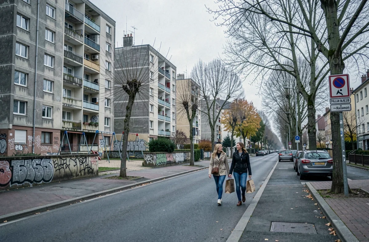
It features the historical boundaries of sensitive urban zones, defined as territories characterized by the presence of large housing estates or degraded housing neighborhoods and by an imbalance between housing and employment. These boundaries are still accessible, even though the ZUS system has been replaced by QPVs since the law of February 21, 2014.
Concrete limits of interactive maps for assessing a neighborhood
No official map provides a ranking of neighborhoods by level of danger. This is a deliberate choice: urban policy targets socio-economic vulnerabilities, not crime levels. Crime statistics by neighborhood are not made public in a cartographic form at the infra-municipal level.
To concretely assess the situation of a neighborhood, several approaches are generally combined:
- Verification of the address on GIS City to determine if the area falls under a QPV.
- Consultation of territorial profiles for income, employment, and housing indicators.
- Researching news articles and recent events through specialized information sources, which complement institutional data with local context.
- Field visits at different times of the day, which remain the most reliable diagnosis to gauge the real atmosphere of a neighborhood.
Feedback varies on this point: the same neighborhood can give very different impressions depending on the time, season, or immediate surroundings. The map delineates an administrative perimeter, not a lived experience.
When using these tools, the most useful precaution is to check, layer by layer, the date of the last update of the displayed data. A 2024 perimeter associated with income indicators from several years ago only provides a partial snapshot of the territory.